
By
Birkan Yildiz
on 04/09/2026, 14:19
Last updated on 9/4/26, 2:19 PM

Both tools tell you how long work takes in Jira. They do not tell you the same thing.
The Control Chart gives you one number per issue: total cycle time. A Jira Time in Status report breaks that number down, status by status. If your job is to answer "what is the status, and why is it delayed?", that difference is the whole point.
Let’s dive in and compare the two in this post.
What the Control Chart Shows
The Control Chart is built into Jira. You find it under the Reports tab on a board. It shows the Cycle Time, or Lead Time, for a product, version, or sprint.
You choose which statuses count as working time. The chart adds up the time each issue spent in those statuses and plots it over a period. Each dot is one issue, or a cluster of issues. The height of a dot is that issue's Cycle Time. Its left-to-right position shows when the issue left the last status you selected.
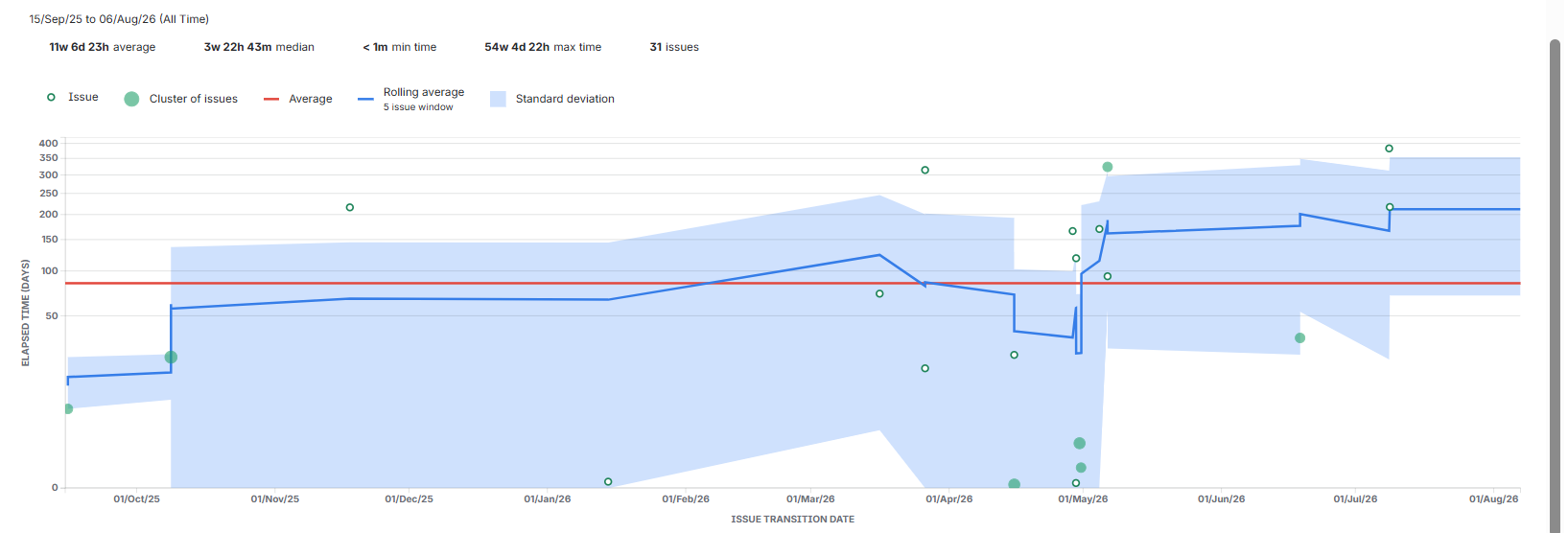
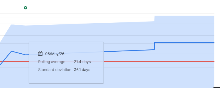
The chart also draws a rolling average and a shaded band for standard deviation. A narrow band means your cycle times are consistent, so you can lean on the average to predict future work. A wide band means you cannot.
That makes the Control Chart good for some jobs. You can review past performance in a retrospective, check whether a process change actually helped, and give stakeholders a trend to look at. Kanban teams can also use it to set delivery targets.
Two things to know before you rely on it:
- It works in company-managed spaces only.
- It can exclude weekends and holidays through your board's Working Days setting, but that setting works at the day level. There is no working-hours setting, so hours on a working day, including overnight hours, are counted in full.
To clean up noisy data, such as outliers, duplicates, or work that is still in progress, you build JQL quick filters and apply them to the chart.
What a Time in Status Report Shows
Timepiece – Time in Status for Jira is a Marketplace app from OBSS. Its Status Duration report shows how long each issue spent in each status. So instead of one total, you get a row per issue and a column per status.
That is the part the Control Chart leaves out. If "Backlog" is where issues pile up, a Status Duration report shows it directly. You can sort by any status column to put the slowest issues at the top.
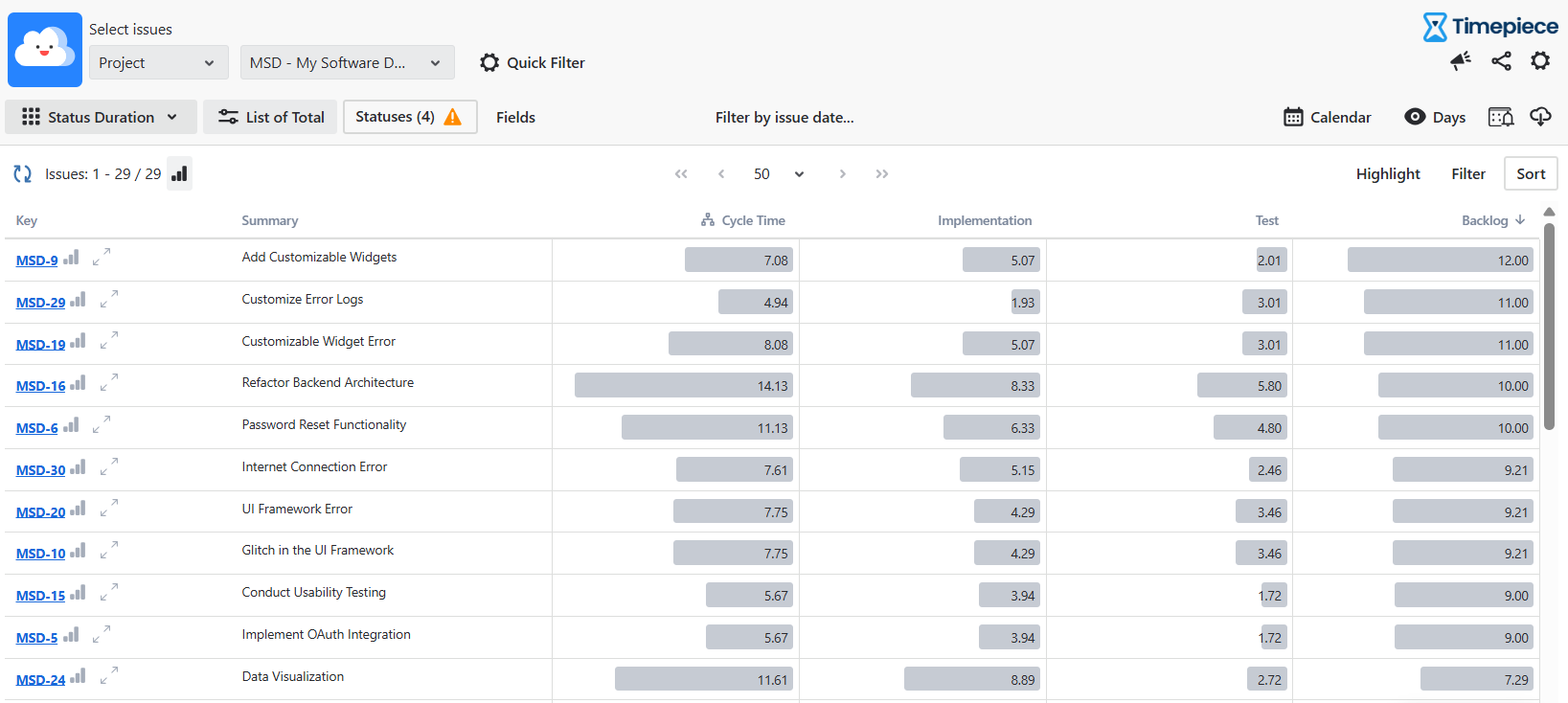
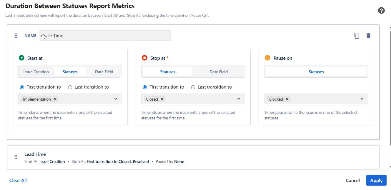
You still get Cycle Time and Lead Time. Consolidated Columns let you combine several statuses into one column and label it Cycle Time, Lead Time, Resolution Time, or whatever you track. There is also a Duration Between Statuses report that measures the time from a start status to an end status.
Count-based reports add another angle. Status Count and Transition Count show how often an issue came back to a status. That points to rework, not speed, which is useful when you want to fix the process instead of chasing people.
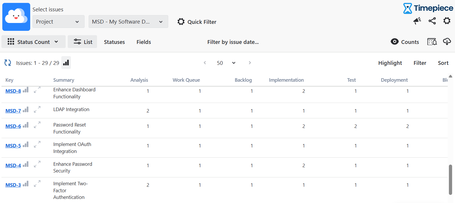
Reports run from your existing Jira history, which means you can generate a report right after installing.
Working Hours vs Working Days
This is the difference teams feel the most.
The Control Chart can exclude weekends and holidays. You do it through your board's Working Days setting, and the change shows up in the chart. But that setting works at the day level. You can drop whole non-working days, and you cannot set working hours inside a day. There are no lunch breaks and no shifts.
Timepiece works at the hour level. You set working days, working hours for each day, holidays, lunch breaks, and a time zone. You can define more than one calendar for teams in different regions. Time outside those hours is left out of the report.
Scope, Setup, and Trust
The Control Chart is free and already in Jira. But it lives on a single board, and it runs in company-managed spaces only.
Timepiece is a Marketplace app. It is free on Cloud for up to 10 users, and paid above that. It is a Cloud Fortified app, and OBSS is an ISO-27001 certified.
Quick Comparison
|
What Offers |
Control Chart |
Timepiece – Time in Status |
|---|---|---|
|
Main output |
One cycle time or lead time per issue |
Time per status, per issue |
|
Finds the exact stuck status |
No, it shows a total |
Yes, column per status |
|
Cycle time and lead time |
Yes |
Yes. |
|
Non-working time |
Excludes whole non-working days, via board Working Days |
Excludes non-working days and hours |
|
Scope |
One board, company-managed only |
Any JQL scope, from Jira history |
|
Rework tracking |
No |
Yes, Status and Transition Counts |
|
Cost |
Free, native |
Free on Cloud up to 10 users |
When to Use Each
Reach for the Control Chart when you want a fast, free read on your Cycle Time trend and how predictable it is, when you are running a retrospective and want to spot outliers, or when a single board in a company-managed space is enough.
Reach for a Time in Status report when:
- You need to see time per status to find the exact bottleneck,
- You want numbers based on working hours, not just whole working days,
- You track SLAs or need Cycle Time across any JQL scope,
- You want to measure rework.
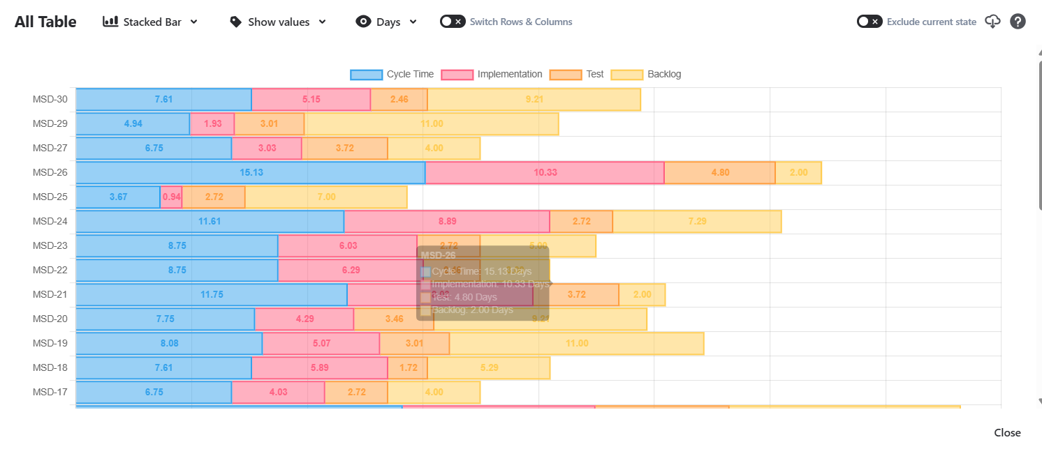
You do not have to pick one. Plenty of teams use the Control Chart for a quick trend read, then open a Time in Status report when a number looks off and they need to know why. The chart raises the question and Timepiece breakdown answers it. The Timepiece report screen displays charts for individual report rows, as well as an overall chart for aggregated reports.
Try It on Your Own Workflow
Want to see where your issues actually lose time? Start a free 30-day trial of Timepiece – Time in Status for Jira. It is free on Cloud for up to 10 users.
If you would rather see it run on your own workflow first, book a live demo with our team.

Multiple charts for issue view screen on Jira Cloud

Charts, Any Field Report and History Trim for Time in Status Server