
By Birkan Yildiz on 06/08/24 11:09
Last updated on 6/9/26 4:57 PM
Visualizing your workflow just got easier. The cloud version of Timepiece - Time in Status for Jira by OBSS now features built-in charts directly within the Jira Issue View.
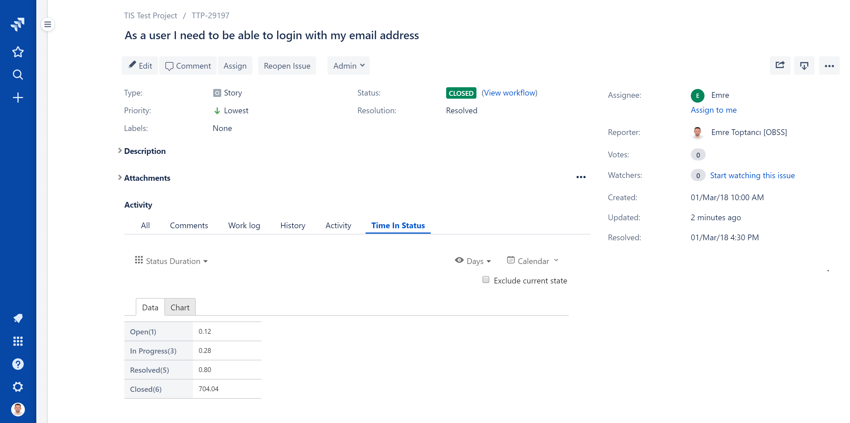
Previously, the Time in Status tab only displayed your reporting data in standard tables. To make this information more actionable at a glance, we have split this view into two distinct sub-tabs: one for your traditional raw data table, and a new one dedicated entirely to visual charts.
What Chart Types Are Available on the Issue View?
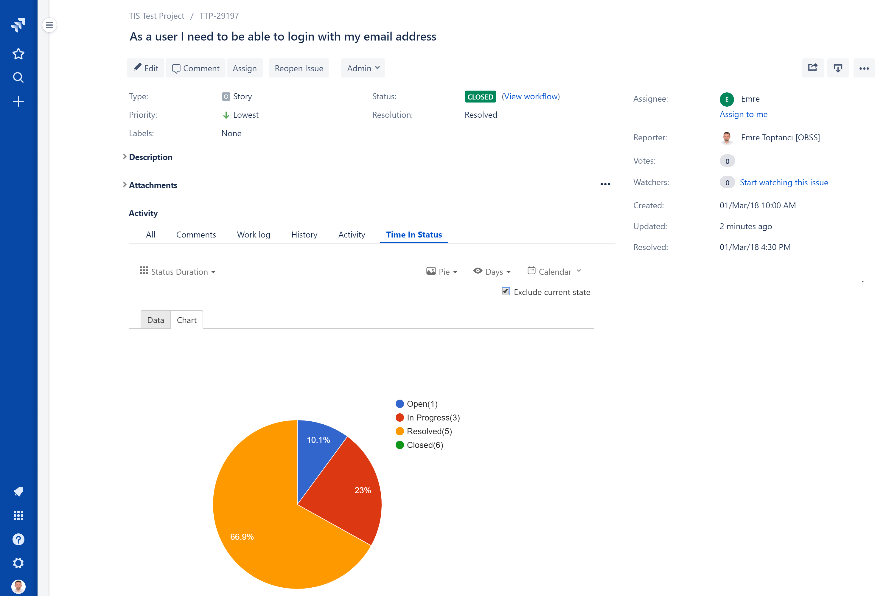
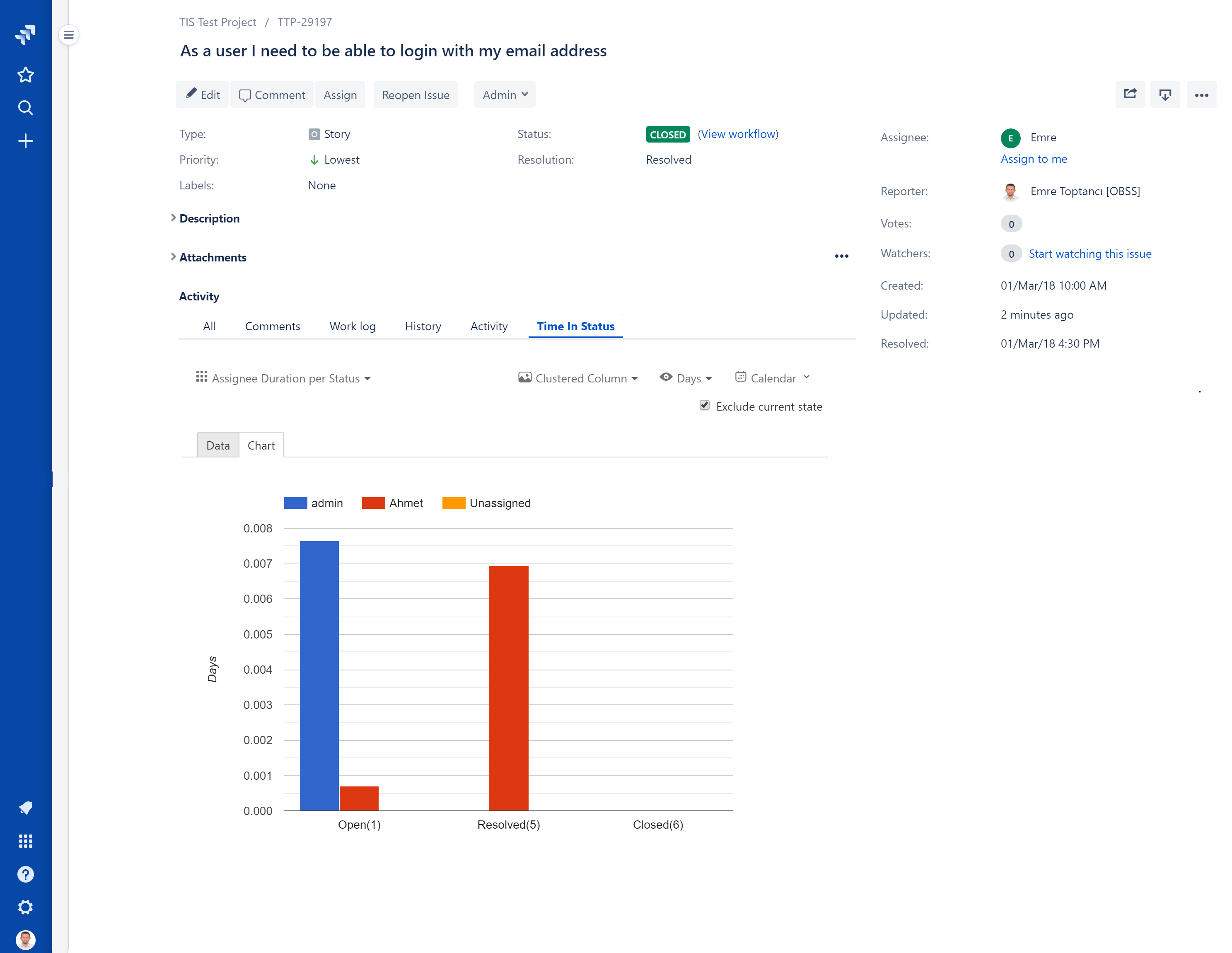
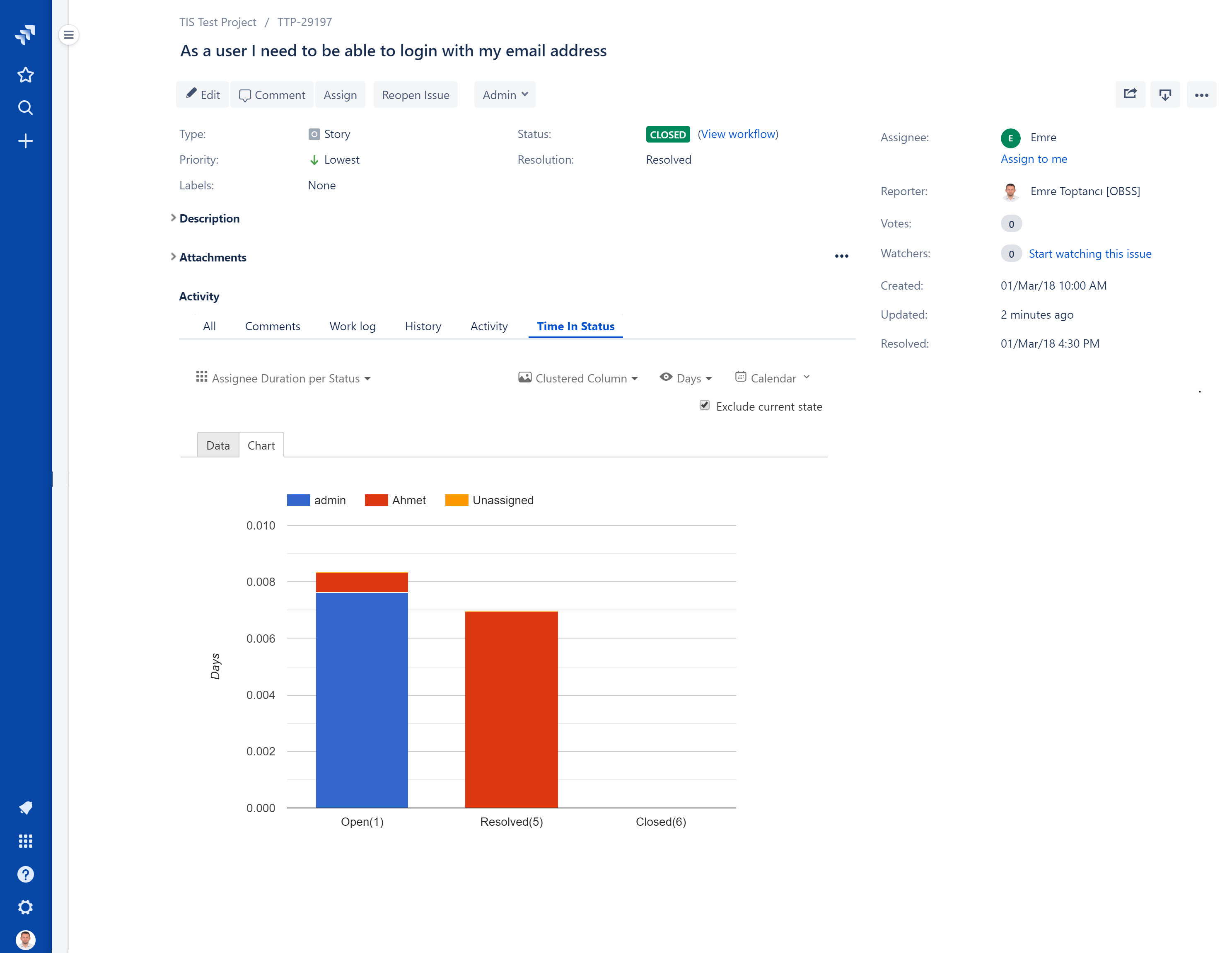
Different reporting needs require different visual formats. Depending on the report type you are running, you can choose from a wide variety of chart options to best display your time-tracking metrics. This flexibility allows you to adapt the view based on what makes the most sense for your specific Jira data.
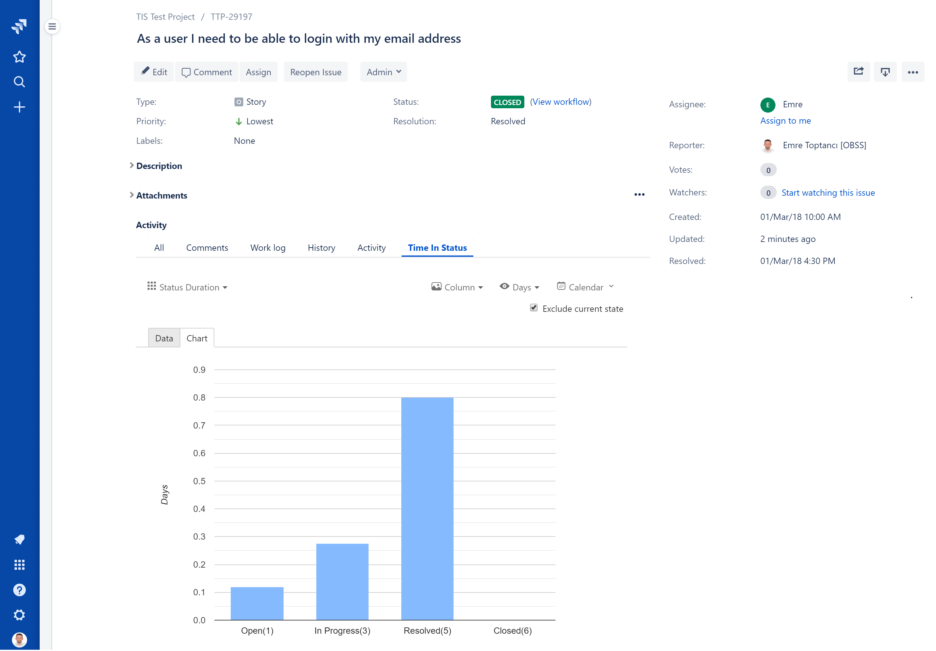
How to Fix Skewed Charts on Older Jira Issues
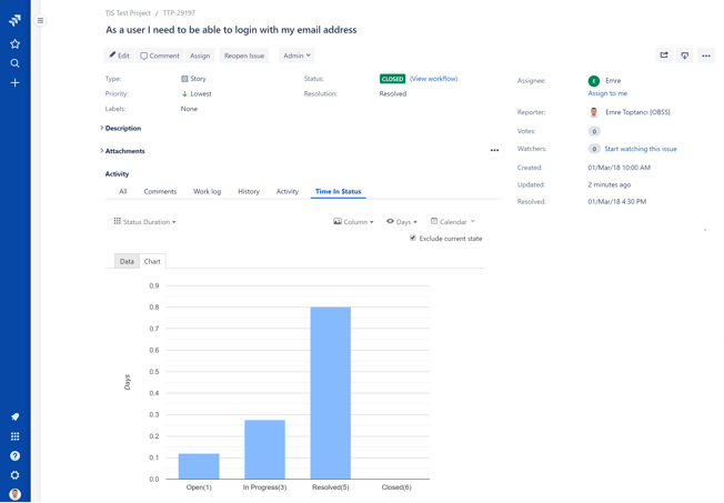
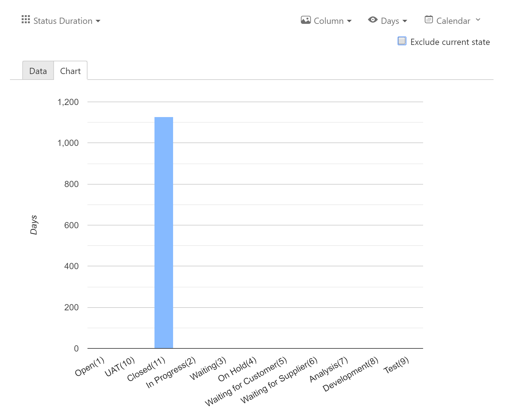
During development, we identified a common reporting challenge. If you look at an issue that hasn't been updated in a long time, such as a ticket that was closed a year ago, the chart becomes practically unreadable. The visualization gets completely dominated by the issue's final, resting state. For example, if you view a column chart for an issue closed 1,100 days ago, that massive "Closed" duration overshadows every other status. The time your team actually spent actively working on the ticket becomes so comparatively small that it disappears from the chart entirely.
Filtering Data With the 'Exclude Current State' Option
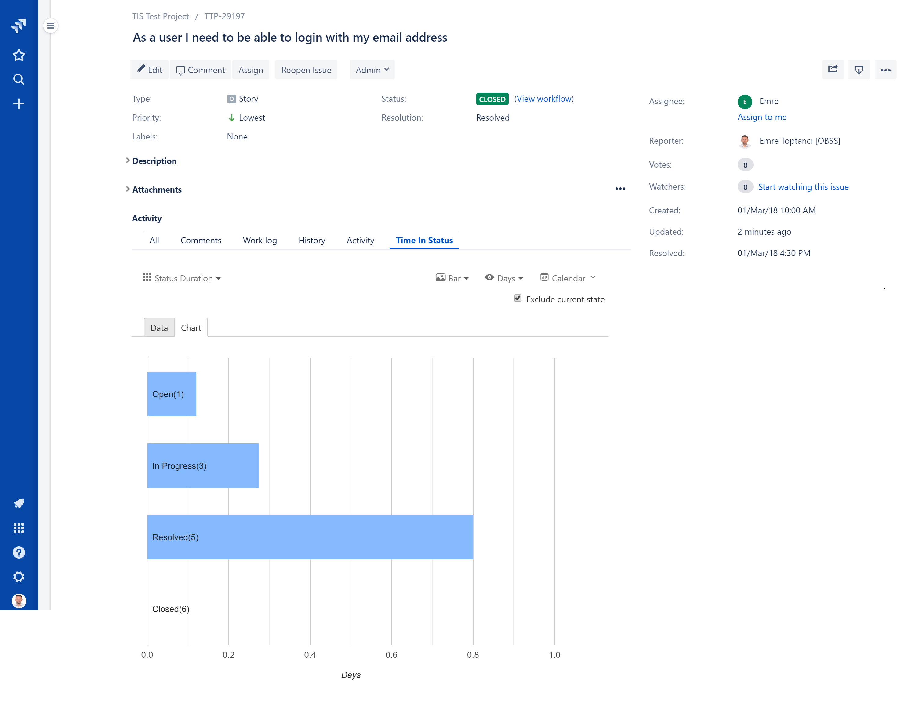
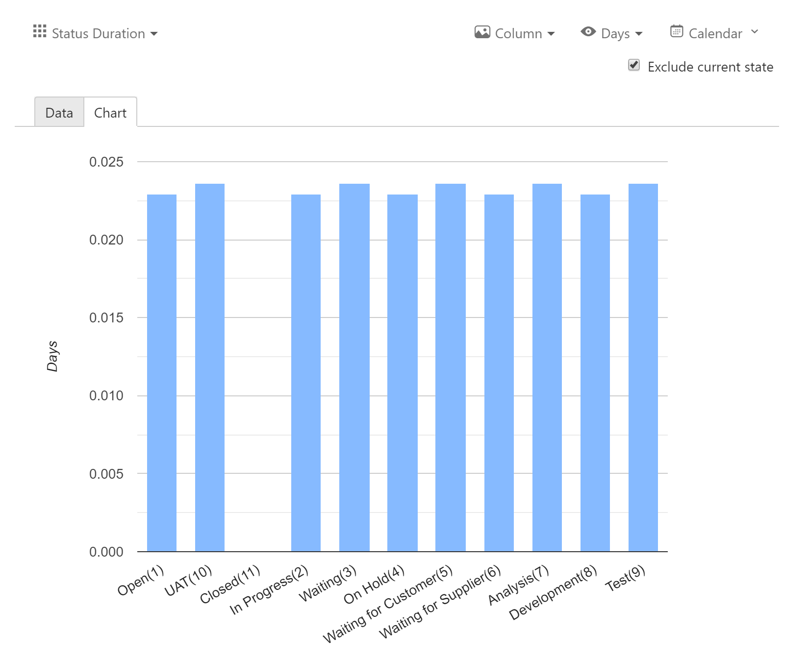
To solve this visualization problem, we introduced the Exclude Current State checkbox. Selecting this option instantly filters out the duration accumulated since the last update on the issue. Once applied, the chart immediately resets its scale. It displays the actual active time spent in previous statuses, providing a highly useful, accurate visualization of the workflow without the final status distorting the view:
How the Exclusion Logic Actually Works
It is important to note that "Exclude Current State" does not wipe the final status from your report entirely. It only excludes the time accrued since the most recent status or assignee change in the issue's history. If a Jira issue bounced into the "Closed" status more than once, the chart will still display a value greater than zero for the "Closed" column. It simply drops that final, ongoing duration so your active work metrics remain clear. As always, if you have any questions about configuring these charts or using the new filter, our team is ready to help.
To learn more about Timepiece, visit its Atlassian Marketplace page. You can also see the official Timepiece documentation page or book a demo.

Introducing REST API for Time in Status Cloud

New Feature: Hide Empty Rows in Timepiece – Time in Status for Jira Reports
No Comments Yet
Let us know what you think